Logo and Branding
The goal of a logo is to perfectly represent your brand to an audience, while also differentiating you from others out there. When someone looks at your logo they should be able to determine two things: if they desire the product or service and if they want to buy it from your company.
On day one of joining AVATAR Partners, I was tasked with leading a complete rebrand of the company—a challenge I embraced from the start. Given AVATAR’s deep roots in XR technology and our focus on immersive, visual-forward solutions, I designed a new logo centered around the concept of vision—featuring a stylized eye to symbolize clarity, insight, and the future of human-machine interaction. From there, I created a full brand identity system, including a modernized website, cohesive color palette, and typography that reflect the company’s innovative spirit and technical precision. The result is a strong, unified visual language that communicates AVATAR’s expertise in XR and reinforces its mission to simplify the complex through immersive, visionary technologies.
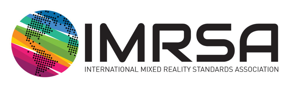
As part of my work with AVATAR Partners, I led the branding and digita design for the International Mixed Reality Safety Association (IMRSA), an initiative founded to establish safety standards in the XR industry. From concept to execution, I developed a complete visual identity that conveys professionalism, trust, and forward-thinking innovation. The logo and color palette—centered around strong blues, industrial grays, and safety-inspired green accents—were carefully chosen to reflect both the high-tech and regulatory nature of the organization. The website was designed with a dual focus: to serve as an educational hub for the public and a dynamic portal for members, featuring streamlined navigation, gated member content, and clear calls to action for joining and contributing. This brand and platform were created to support a growing global community dedicated to advancing safety in XR environments.
The Timeplots logo embodies clarity and precision, reflecting the brand’s dedication to creating intuitive and insightful time-based data visualizations. The clean, modern typography paired with the subtle integration of line and dot elements evokes a sense of plotting data points over time, perfectly capturing the essence of the service. The design’s simplicity and balance convey trustworthiness and professionalism, making it an ideal identity for a platform focused on turning complex data into clear visual pieces of art.
The Zapp logo was created to reflect the raw power, precision, and innovation at the heart of the brand’s high-performance automotive identity. With bold, angular typography and a stylized lightning bolt integrated into the design, the logo captures a sense of speed and electric intensity. It suggests motion even when standing still — a perfect metaphor for the performance-tuned machines Zapp specializes in. The clean lines and aggressive stance communicate strength and technical excellence, while the modern aesthetic positions the brand at the forefront of next-gen automotive engineering. This logo stands as a visual embodiment of Zapp’s commitment to pushing the limits of performance and design.
The Oooze logo was totally one-of-a-kind, just like the guy who made it. With its trippy, drippy letters and weird, wavy vibe, it captured his funky personality perfectly. The site’s not around anymore, but if you ever met him, you’d instantly get why the logo looked the way it did. It was weird, fun, and full of character — exactly how he rolled.
The Victoria First logo was designed to convey strength, reliability, and trust — key pillars in the world of online security. Its bold, uppercase typography communicates authority and stability, while the clean, geometric lines reflect precision and technical expertise. The shield-inspired iconography subtly reinforces the idea of protection and defense, aligning perfectly with VIC’s mission to safeguard digital environments. With a modern, minimalist aesthetic, the logo balances professionalism with approachability, making it an ideal visual identity for a forward-thinking cybersecurity brand.
The Extola logo was designed to embody efficiency and clarity, reflecting its role as an in-house developed content management system (CMS). The clean, modern lines and geometric shapes convey structure and organization, key qualities of a platform built to manage and streamline digital content. The bold typography projects confidence and reliability, while the dynamic icon suggests smooth workflow and connectivity. Together, these elements create a professional and approachable identity that highlights Extola’s purpose: simplifying content management with precision and ease.
When I designed the FLDEM logo, I wanted to create a look that felt both bold and modern, reflecting the brand’s forward-thinking spirit. The sharp geometric icon represents precision and movement, capturing the idea of progress and innovation. I paired it with clean, straightforward typography to keep the design balanced and approachable. Overall, my goal was to craft a logo that feels confident and professional while still being versatile enough to work across different applications.